
A transformational brand strategy
Circles (a division of Sodexo) improve employee well-being and help businesses to thrive all around the world. They do this by saving employees time and making every aspect of their lives easier and more focussed.


The Problem
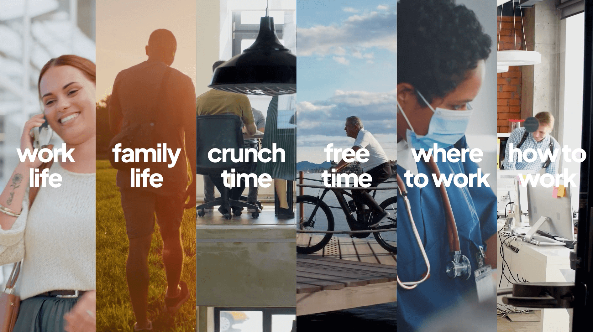
The world in which Circles operates has changed beyond recognition in recent years. Hybrid working, retention challenges, employee expectations, digitalisation and an emphasis on well-being are all now long-term considerations for employers and employees alike. But the brand positioning and visual identity of Circles hadn’t moved forward to reflect this, and they were still broadly considered to be a concierge service.
The Solution
Following our tried and tested i5 approach, we undertook a series of external and internal interviews with key stakeholders to better understand existing perceptions of the organisation. This was paired with competitor perception mapping in multiple markets. Early on, it became clear that there was a territory where Circles could win that they were naturally aligned with - a human, emotive, high quality yet accessible brand positioning with a clear focus on well-being.
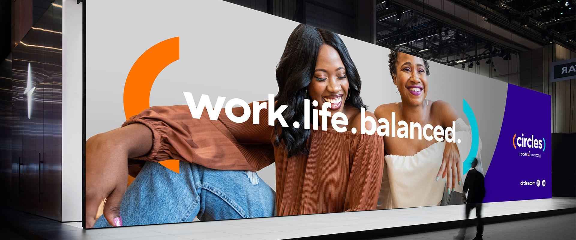
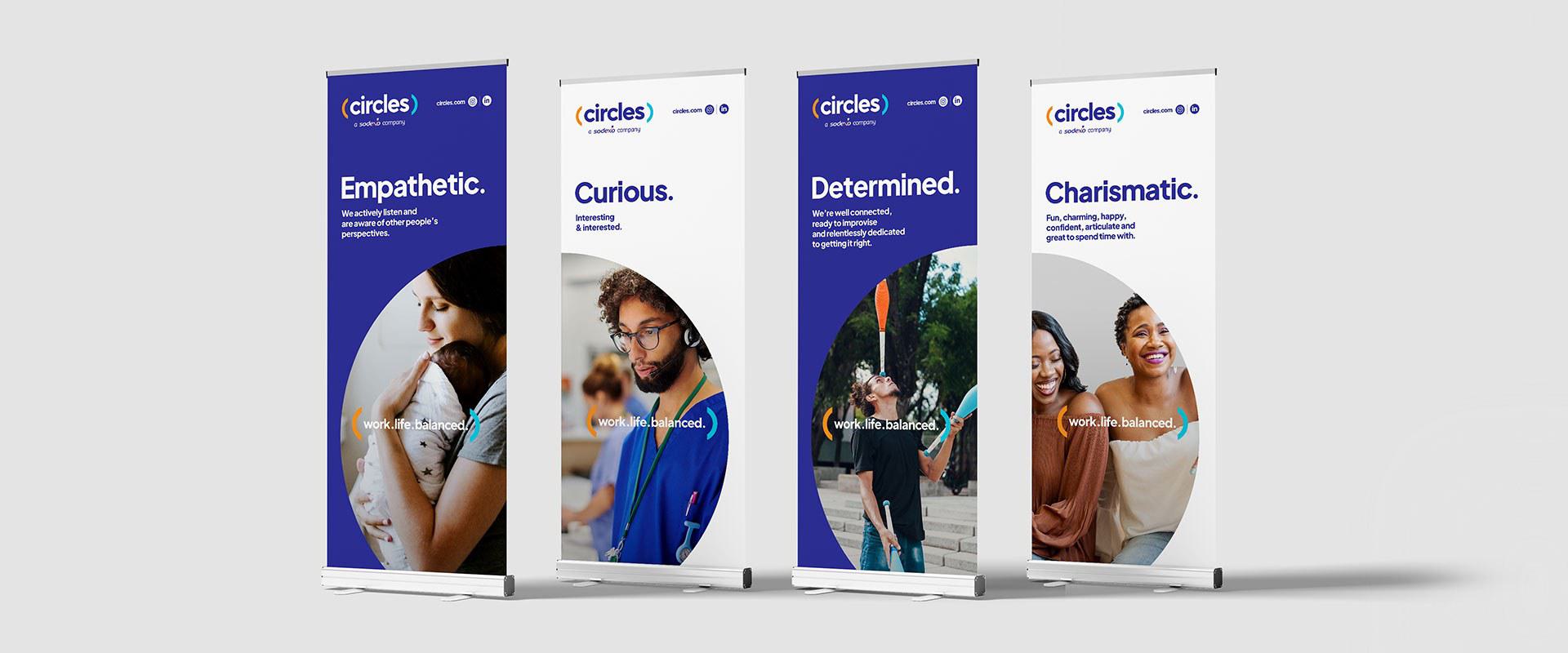
Working with a steering group drawn from the US, France and the UK, we began to articulate the brand through their ‘why’, vision, values and a new core proposition – Work. Life. Balanced. We also developed a clear understanding of the desired brand personality, tone of voice and wrapped everything up into a short and compelling brand narrative.
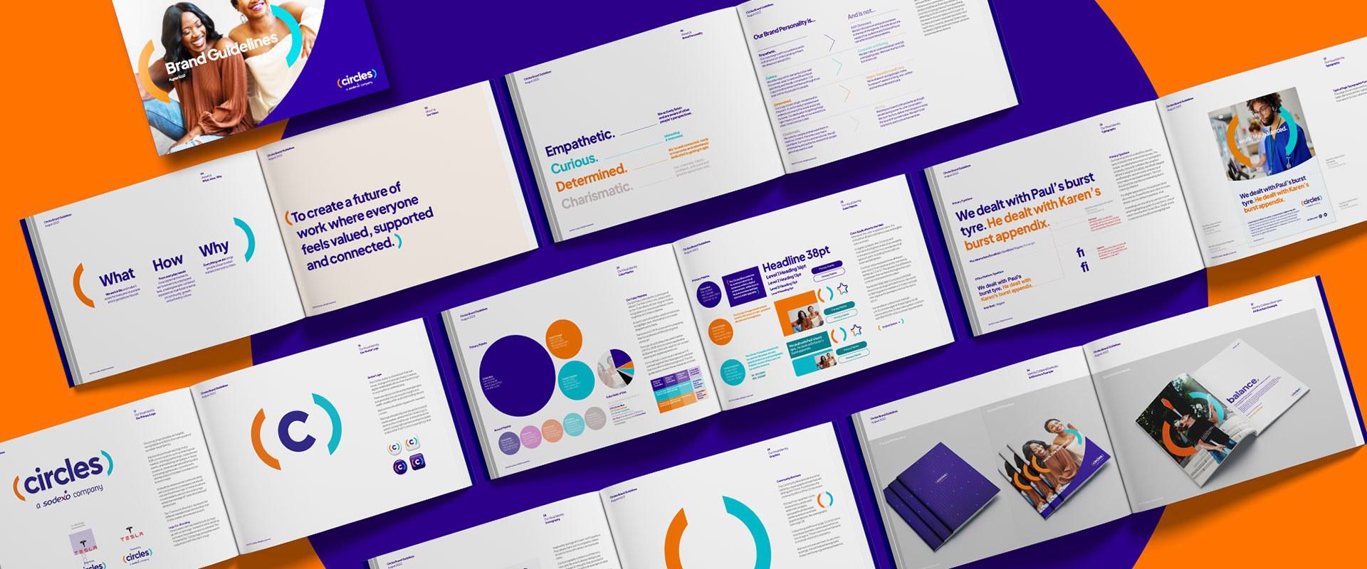
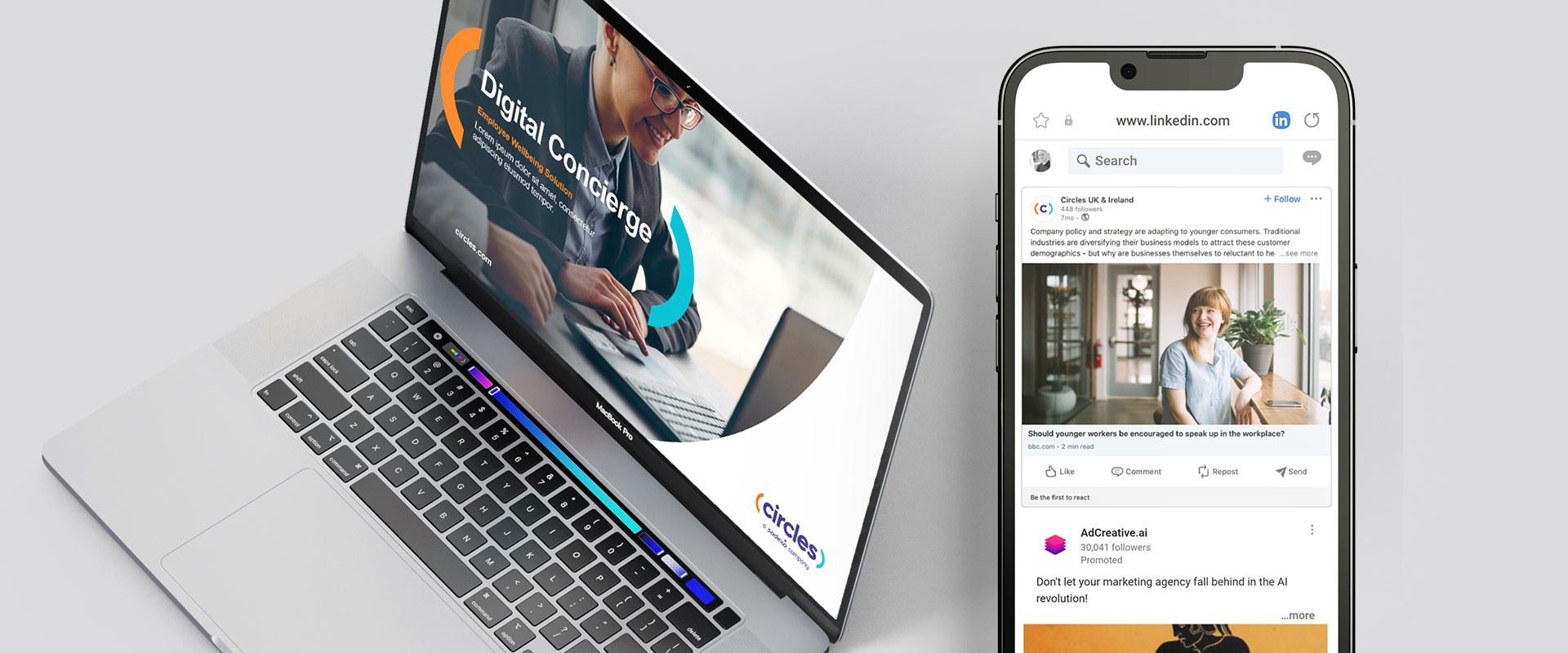
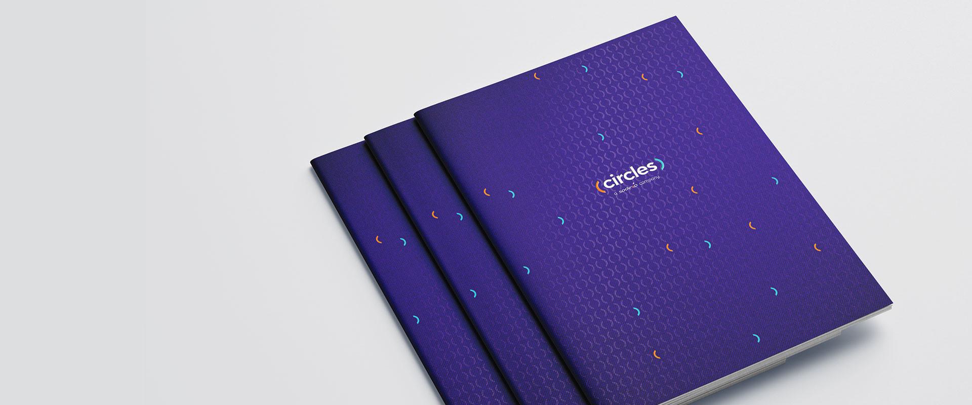
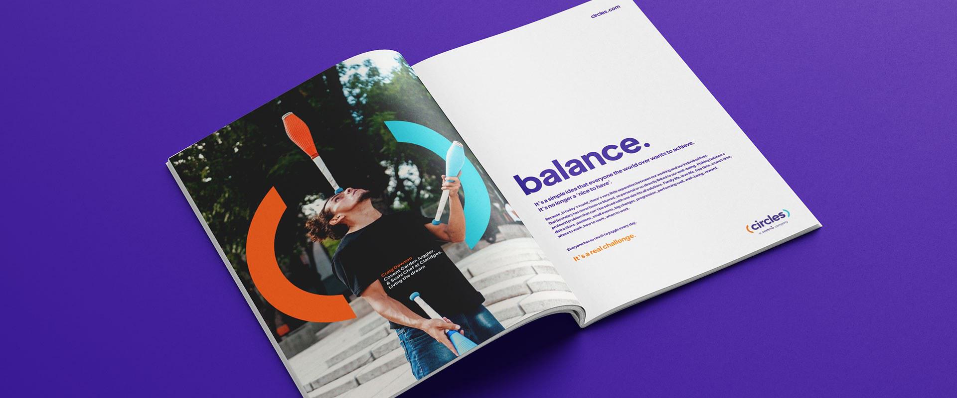
This provided the perfect brief for a distinctive new visual identity that’s confident, human, contemporary and digital ready. From icons to colours, typography, patterns, graphic elements and layouts, every element was carefully considered to provide impact, simplicity and that all-important human touch. The ‘community brackets’ that feature across the identity are formed from a perfect circle, and represent the multiple circles, or communities, that make up our daily lives from family to friends and workplace relationships. Imagery was key to the look and feel with an absolute focus on authenticity - real people in real situations.
Circles’ new identity creates a stronger, much more differentiated market presence across multiple sectors from multi-national corporates to the NHS. Most importantly, it focusses on the well-being of people and brings the benefits of Circles to life across all of the over-lapping communities that make up the daily lives of employers and employees alike.
What the client said
Jacob Bailey’s expertise and thorough process has given us a fresh perspective on our brand. We are confident this new strategy will help us create even more meaningful connections with our prospects, clients, partners, and employees. This strategic transformation represents a significant milestone in Circles’ journey.
Yohan Dehe, Global CEO Circles


