
An aspirational place to live
A new brand strategy and visual identity for Beaufort Park.


The Problem
Beaufort Park forms part of the St George (Berkeley Group) property development portfolio. A site set in 25 acres with stunning, landscaped parkland at its heart, St George approached us to refresh the look and feel for the development and position it as an aspirational place to live.
The Solution
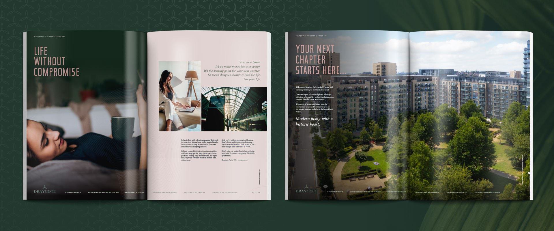
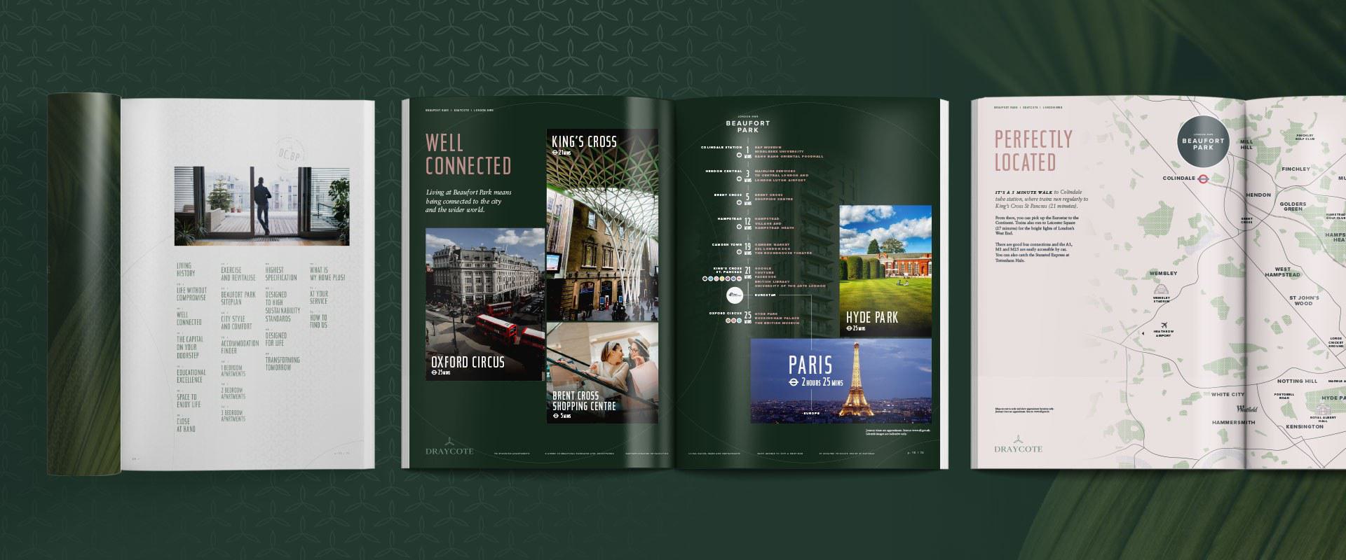
The new brand strategy and visual identity built around our ‘Why Compromise?’ proposition was designed to represent the quality synonymous with the St George brand. Key consideration was given to typography and colourways, reflecting elegance, affluence and a connection to the surrounding environment. Its refreshed logo and look and feel positions Beaufort Park as a sophisticated development, as well as appealing to both the domestic and overseas markets.
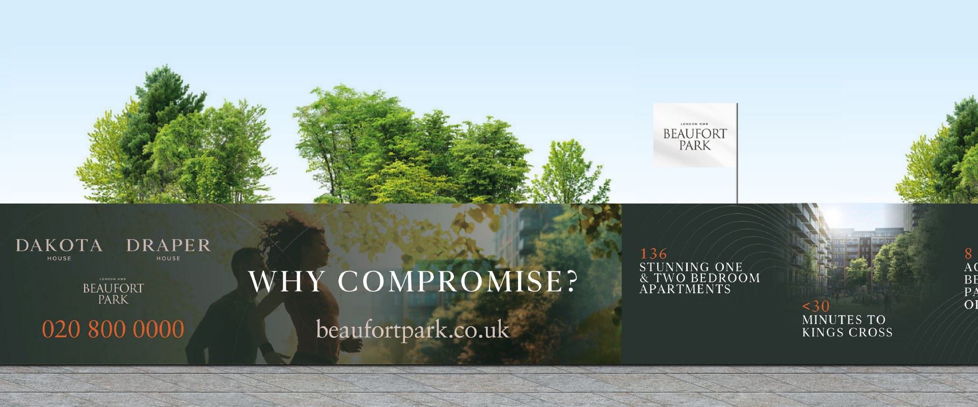
Working closely with the team at St George, we created a range of marketing collateral including over 300 metres of hoarding, detailed fact sheets and a beautiful brochure for the development’s final phase: Building D. These pieces all helped to create intrigue and interest as the last phase of development progressed – showcasing the high-specification apartments and exclusive facilities on-site to reveal a snapshot of what life could be like with a home at Beaufort Park.
If you're looking for results-driven property marketing support, contact us today. Let's do something brilliant together.


