
Evolving a recognised brand
Updating an identity for a brand with more than 50 years’ of history


The Problem
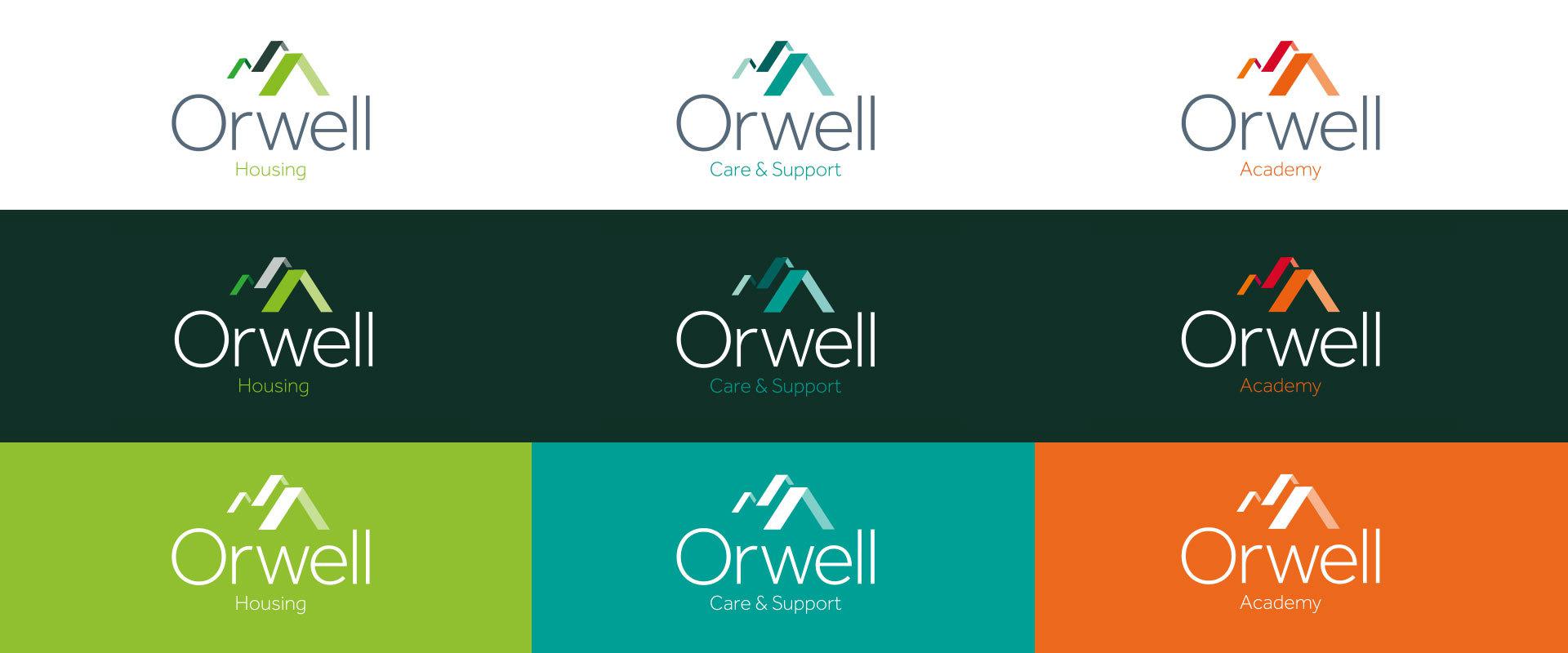
Orwell Housing Association provides homes for over 7,500 residents throughout Suffolk, Norfolk and Essex. The Orwell team needed to bring their brand identity in line with their new vision and values, reflecting their new forward-thinking approach. Also, with several different divisions within the business they required a solution which was transferable across a revised brand architecture.
The Solution
Initially we had to consider how important familiarity was to the business and it’s audiences – should we look at turning a completely new page? Or should it be more of an evolution? What should stay as core elements? What should be lost or retained?
This is where our collaborative workshop approach comes into its own. By working so closely with the Orwell team over several in-depth sessions, we were able to gain valuable insight that provided a clear direction of creative travel.
This led to us exploring several routes from evolution to revolution; exploring new fonts, colours, iconography and how a core logo could flex to encompass their other activities beyond housing such as ‘Care and Support’ and their ‘Academy’.
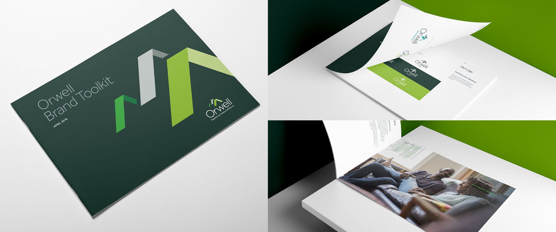
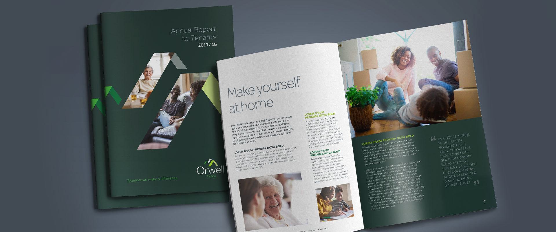
The recognisable roof element of the original mark was retained but evolved as it still represented the core function of the business (providing shelter and homes for people). Its treatment, configuration and colours were all updated, and we also provided imagery guidelines for use going forward.
The end result was a cohesive brand style reflective of Orwell’s new vision and ambitions, but still retaining its core essence that is so well recognised and trusted.
If you're looking to transform your brand, contact us today. Let's do something brilliant together.


